At a glance
What we built
A jewellery catalogue asks shoppers to compare style, type and price visually. A dense grid can make that harder if browsing, saving and cart actions are not clearly separated.
| Product | HaqChain |
|---|---|
| Interfaces shown | Mobile |
| Technology | React Native · Android & iOS · Web & APIs |
| Core work | Jewellery, karat and product filters · Wishlist and product-detail journeys · Web storefront and catalogue administration |
Product flow
How it works
Jewellery, karat and product filters
Wishlist and product-detail journeys
Web storefront and catalogue administration
The interface
Inside the product
Mobile interface · 01
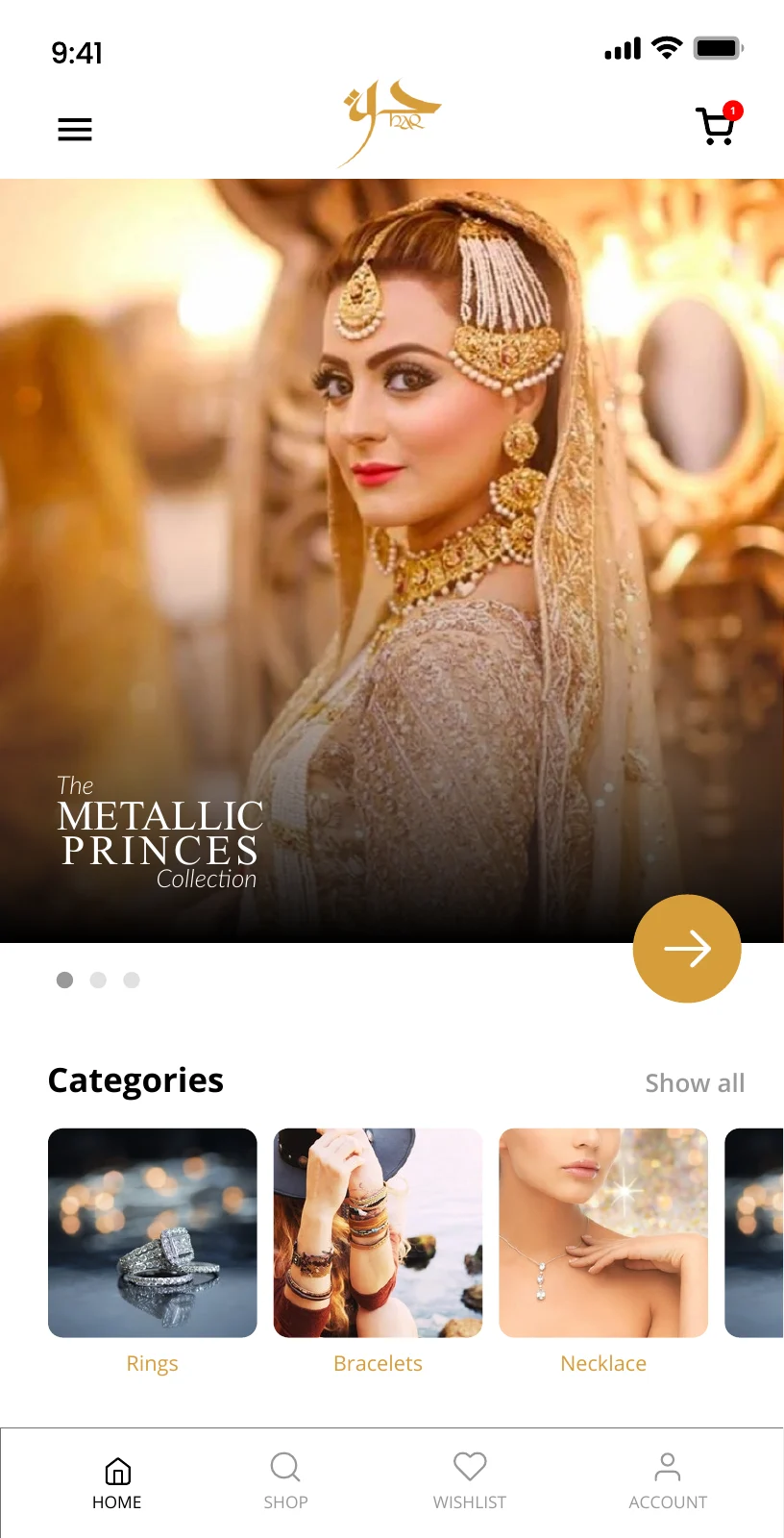
Enter through visual categories
The original mobile design leads with collection imagery and category shortcuts rather than asking shoppers to interpret a dense inventory immediately.
Mobile interface · 02
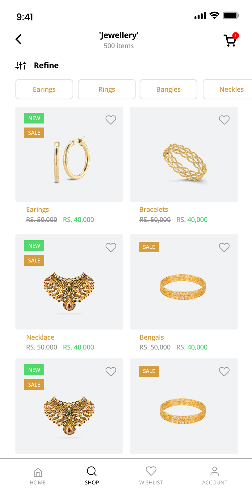
Refine the catalogue
Category controls sit above the product grid, with wishlist and cart actions kept distinct.
Mobile interface · 03
Inspect the product
Product browsing gives each piece its own view before the shopper decides to save it or continue to cart.
Design notes
Decisions behind the experience
The commerce challenge
Make a large jewellery catalogue feel considered
- Collection-led discovery
- Product attributes and filters
- A shared catalogue across shopping surfaces
Read the context
Jewellery is selected through detail: the type of piece, its finish, metal, karat and the way it looks when worn. The product needed to let a shopper explore that detail without asking them to read a dense inventory list. The mobile journey begins with visual collections and gives each category a clear route into the catalogue.
The same range also needs careful management behind the storefront. Product photographs, attributes, prices and availability have to remain coherent as pieces are featured or moved between collections. The web and mobile sides share that catalogue rather than carrying separate merchandise stories.
Customer journey
From a collection to a piece worth saving
- Visual category entry
- Refinement by jewellery attributes
- Separate wishlist and cart paths
Read the context
The home screen introduces collections and categories first. A shopper can then refine by category, karat, price, type, colour or occasion before opening the product detail. This order keeps the early browsing experience visual while letting a specific preference narrow the range when the shopper has one.
The detail view carries the product decision. Saved items belong in a wishlist for later consideration; the cart is the route for a purchase in progress. Keeping those destinations separate lets someone compare pieces without making every tap feel like a checkout commitment.
Merchandising operations
Give the catalogue a working back office
- Category and product management
- Multiple product images and attributes
- Featured collections and storefront content
Read the context
Mobile shopping connects with the web storefront and catalogue administration. The management side covers category structure, product information, images, featured placement and content that explains the collection. Those controls matter because the shopping experience can only be as clear as the merchandise data behind it.
A piece may belong to more than one collection, have several images and carry details a buyer needs before ordering. The interface gives those facts room on the product page while the administration model keeps them editable by the team maintaining the store.
Design and build
A mobile browsing rhythm backed by web and API work
- React Native mobile experience
- Web storefront and catalogue administration
- Designs for home, filters, catalogue and detail
Read the context
The mobile design uses large product imagery, a restrained filter screen and a dedicated product view. Navigation keeps home, shopping, saved items and account activity distinct, while the catalogue itself remains easy to scan. The home, filter, catalogue and product stages form one connected experience.
The delivered scope spans a React Native mobile application and supporting web and API work. That division puts the tactile browsing experience on the phone and the detailed catalogue controls where staff can maintain them.
Design and development
What powers it
Platform and technology
React Native · Android & iOS · Web & APIs
Core capabilities
- Jewellery, karat and product filters
- Wishlist and product-detail journeys
- Web storefront and catalogue administration
Questions about the product
Questions about this product
What does this product help people do?
A mobile shopping experience with category browsing, product detail, wishlist and cart journeys.
Which screens can I explore?
Enter through visual categories, Refine the catalogue, Inspect the product.
What capabilities are covered?
Jewellery, karat and product filters, Wishlist and product-detail journeys, Web storefront and catalogue administration.
Mobile projects