Most plants have a historian with years of signals in it, and most leadership teams still get their numbers in a spreadsheet someone exported by hand. The data is there. The path from it to a KPI an executive will act on is what is missing.
Building that path is a system design problem, not a charting problem. Get the model, the adapters and the rules right and the charts are the easy part.
Start From the Hierarchy, Not the Tags
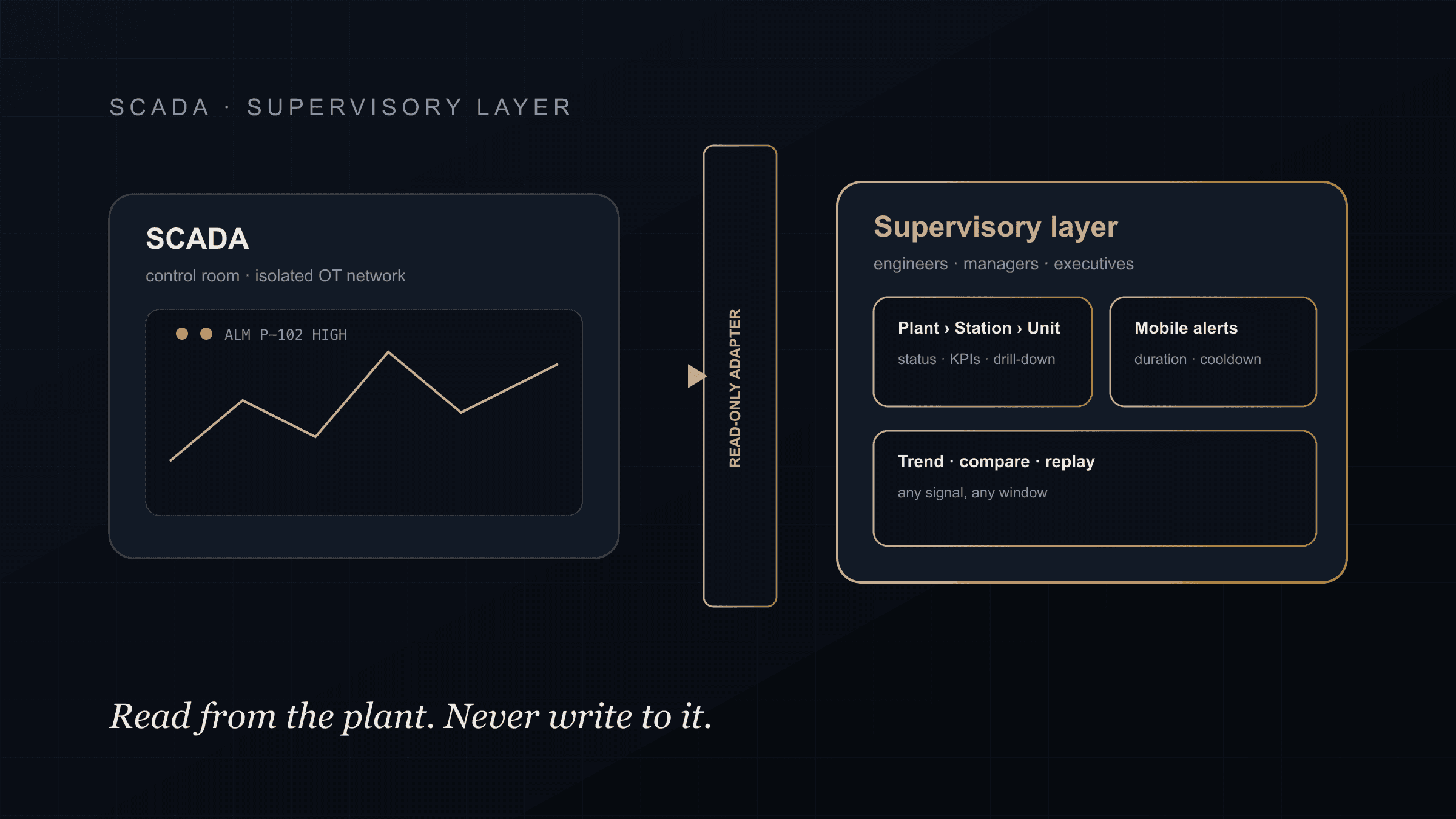
A historian stores tags. A leader thinks in plants, stations and units. The first job of an executive reporting layer is to map thousands of tags into that hierarchy, so a regional director sees plants, a plant manager sees stations, and an engineer drills to a unit's hourly graph, all from the same tree.
Once the hierarchy exists, every KPI has a home: availability, output, electrical metrics, energy and peak values at the level where someone owns them.
Read From the Historian, Never Write to It
The historian is the system of record. The reporting layer reads from it through read-only adapters and keeps its own data (report configurations, alert rules, user preferences, manual energy entries with an audit trail) in a separate, client-approved store.
This single rule keeps the reporting layer safe to modernise. Nothing you do in the dashboard can alter the record the plant runs on, and the control network stays segmented, which is the same discipline behind the whole industrial automation practice.
Make the Numbers Agree
Executives stop trusting dashboards the first time two screens disagree. The fix is one data model serving every audience: the operator's unit view, the manager's station view and the executive's regional view all read the same computed values, so the number on the phone matches the number on the wall.
It also means being honest about data quality. Every value carries a freshness and quality flag, and the interface says "unavailable" or "zero" explicitly instead of drawing a confident line through a gap.
Alerts Executives Will Actually Keep On
An executive who gets twenty alerts a day turns them off. A personal alert rule needs a duration (the condition must hold), a quality check (the data must be fresh and valid), hysteresis (no flapping at the threshold) and a cooldown (no repeats every minute). It needs an inbox that records when it was seen, and it needs to treat "seen" and "recovered" as different states.
Rules built that way stay on, which is the only way they are useful.
History, Comparison and the Annual Report
Leadership questions are comparative: this month against last year, this unit against that one, this peak against the record. The reporting layer should answer them directly, with historical, annual, peak and energy views and a consistent compare function, rather than exporting to a spreadsheet to do the maths.
Reports that leadership already relies on (interchange, renewables and battery views, regional coverage) belong in the same layer, so one system replaces the folder of exports.
Mobile Is the Real Interface
For most executives the phone is the primary interface, not the desktop. A shared iOS and Android app with the hierarchy, KPIs, history, comparisons and personal alerts, with role-based access and localisation where the business needs it, is what turns a reporting project into something leaders open every day.
We laid out the broader supervisory layer this sits inside in SCADA vs modern supervisory dashboards, and the energy and utilities page shows the plant-to-unit shape in detail. If your historian is full and your leadership is still on spreadsheets, book a discovery call and we will map the path from your tags to KPIs they will trust.
FAQ
What is executive plant reporting?
It is a reporting layer that turns historian and SCADA data into plant, station and unit KPIs for leadership: availability, output, energy and peak values with history, comparisons and personal alerts, usually delivered on mobile.
Can this be built without writing to the PI historian?
Yes, and it should be. The reporting layer reads through read-only adapters and stores its own configuration and application data separately, so the historian remains the untouched system of record.
Why do executives stop trusting dashboards?
Because two screens disagree, or a chart draws a confident line through missing data. One shared data model for every audience, and explicit quality and freshness flags, are what keep trust.
How do you stop executive alerts from becoming noise?
Every rule carries a duration, a data-quality check, hysteresis and a cooldown, with an inbox that separates "seen" from "recovered". Rules built that way stay switched on.